There are many things that you can do to serve optimized images online to your site visitors. You can take it to a level of extreme care and granularity, which will take much time away from you. Or you can follow simple steps, which we outline in this post. Here we’re looking for the most efficient path with the least amount of effort to optimize. But first, let’s define what optimizing images means for the purpose of this article: serving your site visitors a good quality image regardless of the device, consuming the lowest amount of bandwidth, hence making your site fast and the page load inexpensive for you and for them. After all they pay for bandwidth to download it, and you pay for bandwidth to serve it.
Before publishing
Before you start writing an article in your content management system (CMS) and include images, you need to acquire them and edit them. When saving an image you can choose various sizes, and various formats. If you host a photo site and you will sell images in the highest resolution, then you are in the unique situation of wanting the absolute best resolution and quality you can get. So you will save and get ready for publishing with the highest res. In other cases you want to serve a good quality image to someone viewing it on a desktop, potentially with a nice and big monitor. At the same time you may not need the full native quality. In that case you can use JPEG options and play with quality settings. Experiment until you find what looks good to your eyes and whether you want full HD, 1920 x 1080, or 4K, 3840 x 2140 pixels, or less. Take a look at the size of each photo and determine whether your users really need to see images that big. Even if later on the image gets scaled it may get uploaded in your CMS in the native size, taking storage space. In many cases you might want to measure the width of your desktop theme, which, unless the image is opened full screen, is the highest size it will be served to any user. For example if your desktop theme is 900px wide, you could save images at 900px width with your choice of JPEG compression. Before publishing is the time you can change the JPEG compression settings and how much space a given image is going to take, natively.
During publishing
Sizes to save in the CMS
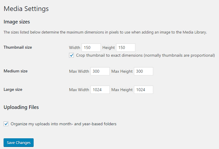
When uploading images to your CMS you have the ability to choose which sizes it will store them in. WordPress provides 3 dimensions that you can edit. This means that if you store an image it will create 4 distinct copies of that image: a large, a medium, a thumbnail, plus the original image size you are uploading. This is handy: if your theme maker coded your theme correctly, it will serve the medium image to mobile users, the large image to desktop users, and the thumbnail if some widget calls for that size.

Now once we save an image WordPress puts the 4 copies on our server. For the purpose of this article we changed the large size width to 700px, and used a native image that was 768px wide. Let’s take a look at the uploads folder on the server:

Requirements for display list evolving requirements, such as the featured image being at least 696px and the site logo being on a white or clear background.
Data and metadata
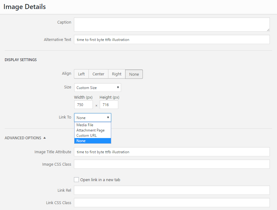
Once you are writing your article or post, you can edit the image as well, the way you want it to show in that specific post. You can change the size – but warning: if you change the size at this point it may serve an image bigger than it will display it. If that’s a small difference it’s OK. But say you upload a full HD photo into your post and then change the size to 200px in the post image editor: your users will need to download the full HD image, then their device will shrink it down for display. This is very slow and ineffective, and search engines and speed test analyzers will warn you about it. Essentially this consumes bandwidth with no benefit to the end user: the size is set to 200px for all devices, with that option. Changing size of images inside the post editor is not ideal and must be avoided if possible.

You’ll notice in the screen shot, that you have the ability to set what happens to the image: should it point to a URL? Open the image URL path? Linking options provide flexibility. You can also provide the metadata for the image, which some social networks and tools use as description, like Pinterest. At this point, you have images that are sized reasonably for your use case, and that are sized in the CMS so it can show the larger or smaller version efficiently, depending on the device type.
After publishing
If you are using a cache or a CDN, like CloudFlare, these tools offer you options to further optimize images. In that case the CDN will scan your site, make copies of images on its servers, put these copies all over the world (that’s what a CDN does and what makes your site faster by locating files geographically closer to users), and it will make these images also lighter in size while keeping equivalent quality. Pro customers of CloudFlare now benefit from automatic JEPG to WebP image conversion. CloudFlare will serve the newer WebP format to users without you having to convert any image yourself. Last, your server has an option to compress content using GZIP. Just like a zip file is smaller than its standard format, GZIP compresses content before it leaves your server. Smaller data packets travel over the internet, then the browser of your user’s devices decompresses the content and shows it to them. Enabling GZIP is another easy win, not just for images, for all content your server is sending.

This is very helpful. Thank you, Nicolas. I have a few–ok, many–questions.
1) You mention: Before publishing is the time you can change the JPEG compression settings and how much space a given image is going to take, natively.
–>Would this be done in photo editing software such as Adobe Lightroom?
2) I have been exporting my photos from Lightroom with the dimensions I ultimately want on my page with a max size (say around 200k) and 96dpi. For instance, a typical blog photo I’d export as 400 x 600, and then I import it into WP’s media files this way–as a 400 x 600 file. This way, I don’t have to tell WP what image size I’d like it to serve. Is this a good or bad strategy? I am gathering from your blog post, I should be importing much larger size files into WP (they’re *huge*, then choosing what size I’d like them served up–large, medium, or thumbnail. Mine is not a photo-centric website, but I think I’d like the photos to be bigger than they are.
3) Which “Link To” option do you like best? My WP was defaulted to “Attachment Page,” but randomly changed to “Media File” without my knowledge.
4) You mention: Experiment until you find what looks good to your eyes and whether you want full HD, 1920 x 1080, or 4K, 3840 x 2140 pixels, or less. Take a look at the size of each photo and determine whether your users really need to see images that big.
–>1920 x 1080 is still a sizable file (probably close to a MB or more). If I embed this photo in a blog, won’t that slow down the loading of the page?
5) You mention: Changing size of images inside the post editor is not ideal and must be avoided if possible.
–>Why is this so? And “inside the post editor” means inside the window entitled “Image Details” in WP, correct?
Thank you again for this post, Nicolas.
Heidi
Hi Heidi,
1) Correct, most photo editors allow you to play with the image size and quality when saving to JPEG. Can be done with Adobe Lightroom, Photoshop, Elements, or free programs like GIMP.
2) You can import images into WordPress in the highest size you want your site to show them to users. The article includes a screen shot of how WordPress saves one image: it saves the native format + 3 other formats that you define in settings. So if you have enough storage on your server/host and one day you might want to serve larger images, you can upload them larger. For most cases, you can make a good tradeoff by thinking about the largest desktop theme width you’ll likely be using and upload your native image with that width. For example if your theme’s content width won’t be larger than 1200px, which for today’s standards is a lot, no need to upload images into WordPress that are any higher than that. You can even go lower than that, e.g. your current theme’s content width. Note also that if your WordPress theme works as intended it should choose for you, which of the 4 image sizes it will serve to your visitors. That’s why it’s handy for you to define sizes in Media Settings, the rest happens automatically.
3) There is no best option for “Link to”. In most cases we default it to None. Search engines can still index it.
4) Same as #2, you are correct that for most purposes images don’t need to be uploaded to WordPress at full resolution.
5) The article and the video discuss it. When resizing from the image editor WordPress could take a large image and if it’s resized in the editor, download the full image but serve it small to users. You and your users will benefit from letting your CMS/WordPress decide which of the different images it saves to serve.
Good luck!